In K-12 classrooms, analyzing map data means using maps and local datasets to teach students how to observe patterns, ask evidence-based questions, and make claims backed by spatial evidence. It builds civic literacy and data literacy at the same time, without requiring any technical GIS background. A single activity can run 10 to 20 minutes as a warm-up, or expand into a multi-day project tied to your existing curriculum.
TL;DR:
- Map analysis lessons are quick to implement, with observation routines fitting into 10 to 20 minute activities suitable for any grade level.
- The six-step protocol—orient, observe, layer, interpret, verify, act—can be scaled from elementary to high school, with increasing complexity for older students.
- Free tools like NOAA’s SOS Explorer and National Geographic MapMaker meet most classroom needs, making advanced GIS software unnecessary for most K-12 settings.
- Teachers should emphasize verifying map data sources and checking for confounding factors to avoid overinterpreting patterns as causal relationships.
- Professional learning courses support building data-literacy and inclusive lesson design, with structured units and feedback tailored to classroom needs.
Table of Contents
- What Does It Mean to Analyze Map Data in Class?
- How Do You Analyze Map Data With Students Step by Step?
- Scaffolding Map Lessons for Every Learner
- Which Tools and Data Sources Work Best for Classrooms?
- How Do You Assess Map-Data Assignments?
- How Does EmpowerED Professional Learning Support This Work?
- Raster vs. Vector: The Two Types of Map Data Your Students Will See
- Common Techniques Students Can Use to Spot Patterns
- Do You Need Advanced GIS Software for This?
- Reading Map Results Without Jumping to the Wrong Conclusion
- Where Map-Data Skills Show Up Outside the Classroom
- An Editor’s Take on Why Maps Belong in Every Subject
- Take Your Map Lessons Further With EmpowerED
- Sources
- FAQ
What Does It Mean to Analyze Map Data in Class?
Analyzing map data in a K-12 setting is fundamentally different from the technical spatial analysis a city planner does. You are not teaching coordinate systems or projection math. You are teaching students to look at a map, notice something, ask why, and defend an answer with what the map actually shows.
That distinction matters for how you plan. A civics teacher might use an election-results map to discuss voter turnout patterns. A science teacher might use a temperature map to spot regional trends. An elementary teacher might use a neighborhood map to practice reading a legend. All three are doing the same core skill: turning visual information into a defensible claim.
Three activities get you started without a steep learning curve.
- A 10 to 20 minute observation routine. Project one map. Ask students to write down three things they notice, then use a Visual Thinking Strategies style script: “What’s going on in this map?” “What do you see that makes you say that?” “What more can we find?” This format comes directly from NOAA’s Science On a Sphere teacher guide, built for exactly this kind of short, low-prep lesson.
- Compare two maps with a Venn diagram. Show students the same region across two time periods or two data types (rainfall vs. drought, for instance) and have them sort observations into “only map A,” “only map B,” and “both.” This forces inference rather than simple description.
- A local-data mini project. Have students overlay a community dataset, like school locations or park access, onto a base map and connect it to a real question their community faces.
Pro Tip: Start every new map activity with the observation routine, even if you plan to move into a bigger project. Students who practice noticing before they analyze ask sharper questions later.
How Do You Analyze Map Data With Students Step by Step?
A repeatable protocol keeps map lessons from turning into “look at this cool map” moments with no real learning attached. Use the same six-step sequence regardless of subject or grade band, and students will start applying it independently by the third or fourth try.
- Orient. Before any discussion of content, have students identify the title, legend, scale, and source. Skipping this step is the single most common reason students misread a map.
- Observe. Give silent think time, then collect noticings using conditional language: “It looks like…” or “This might suggest…” rather than flat statements. This keeps the door open for revision as evidence accumulates.
- Layer. If your tool allows it, add or toggle a data layer and ask what changed. This is where pattern recognition actually happens.
- Interpret. Students draft a claim supported by specific evidence from the map, including where the data came from.
- Verify. Cross-check the claim against a second, trusted source, like the U.S. Census Bureau or a local open-data portal.
- Act. Students turn their interpretation into a product: a short story map, a poster, or a two-minute presentation.
Two structural choices make this protocol work in real classrooms:
- Assign roles for group work (navigator, recorder, questioner, source-checker) so participation is not left to chance.
- Keep the verify step non-negotiable. Skipping it is how misread maps turn into confidently wrong conclusions.
An ArcGIS-based inquiry unit that followed a similar backwards-planning structure found students strengthened both their geographic analysis and their civic understanding, but only when teachers paired the technical steps with deliberate formative checkpoints.
Scaffolding Map Lessons for Every Learner
Map-reading skills are not evenly distributed across a classroom, and treating them as if they are is the fastest way to lose struggling readers in the first five minutes. Pre-teach map conventions with analog activities first: a walk audit of the school hallway, or a hand-drawn cognitive map of the neighborhood, before ever opening a digital tool. Students who sketch their own mental map of a familiar space transfer that skill to digital maps far more easily.
Build in multiple ways for students to engage, take in information, and show what they know, consistent with Universal Design for Learning principles. That might mean:
- Offering the same map with a printed data table as a backup for students who need text alongside visuals.
- Letting students respond orally, in writing, or through a labeled diagram.
- Using sentence frames (“I notice ___ because ___”) so English language learners and students with language-based IEPs can participate on equal footing.
Avoid framing questions as if there is one right answer to find. Instead, ask what evidence supports a claim, which keeps the activity open to genuine debate.
Pro Tip: If your class has a tech-learning curve, rotate one device per a pair of students, run a two-minute teacher-led demo before anyone touches a mouse, and appoint one “peer expert” per table who got a five-minute head start.
Which Tools and Data Sources Work Best for Classrooms?
You do not need enterprise GIS software to run effective map-data lessons. A handful of platforms cover nearly everything a K-12 classroom needs, each suited to a different lesson type.
- NOAA’s SOS Explorer works best for quick global data visualizations. Its teacher guide is built around 10 to 20 minute observation lessons, making it the easiest entry point for a first-time map activity.
- National Geographic’s MapMaker offers standards-aligned, guided lessons with layering, time-lapse, and 3D views. Its interface is intuitive enough for middle school classrooms and supports differentiation without extra setup.
On devices: Chromebooks handle all four tools without issue, and BYOD classrooms work fine as long as you screen for browser compatibility ahead of time. If your school has spotty Wi-Fi, pre-load static map images as a backup so a connectivity hiccup does not derail the whole period.
How Do You Assess Map-Data Assignments?
A short exit ticket tells you more than a long rubric most days. Ask students to write one claim and one piece of supporting evidence from the map before they leave, and you will spot misconceptions before they harden.
For graded work, a compact four-point rubric works across grade levels:
- Claim: Is it specific and answerable from the map?
- Evidence: Does the student cite an actual feature, pattern, or data point?
- Interpretation: Does the explanation logically connect evidence to claim?
- Provenance: Does the student note where the data came from and whether they checked it?
Lesson durations for this kind of work range from 10 to 20 minute quick exercises up to multi-day project units, so scale your rubric expectations to match the time invested. A 15 minute exit ticket does not need the same rigor as a week-long StoryMap project.
How Does EmpowerED Professional Learning Support This Work?
Most teachers do not lack ideas for map-based lessons. What they lack is time to build the data-literacy scaffolding underneath them. That gap is exactly what Data Literacy for Teachers addresses: classroom-ready lesson sets, personalized instructor feedback, and a PD certificate you can apply toward your requirements.
If your bigger challenge is reaching every learner in a mixed-ability room, pair that course with Universal Design for Learning (UDL) & Accessibility, which walks through the exact engagement and representation options referenced in the scaffolding section above. And if you are experimenting with AI tools to generate practice datasets or differentiated prompts, AI in Education: From Basics to Ethical Integration covers how to do that responsibly.
A middle school social studies teacher piloting a community-mapping unit used this combination: a data-literacy module to structure the six-step protocol, then a UDL module to build in sentence frames and multiple response formats for a class with several English language learners. The unit ran over four class periods instead of one, but engagement held steady through the whole sequence.
Raster vs. Vector: The Two Types of Map Data Your Students Will See
Every map your students look at is built from one of two data types, and knowing the difference helps you explain why some maps look blocky and others look sharp. Raster data is made of a grid of pixels, each one holding a value like temperature or elevation. Satellite imagery, weather maps, and heat maps are almost always raster. Zoom in too far and you will see the individual squares.
Vector data is built from points, lines, and shapes with defined boundaries, like a county border, a road, or a school location marked as a dot. Vector maps stay sharp at any zoom level because they are drawn from mathematical coordinates rather than pixels.
For classroom purposes, the practical difference is this: raster maps are best for showing continuous patterns across a whole area (temperature, rainfall, population density gradients), while vector maps are best for showing discrete features you can count, name, or trace (school districts, bus routes, park boundaries). A lesson comparing drought severity across a state will use raster data. A lesson mapping which neighborhoods have a park within walking distance will use vector data.

Most of the classroom tools mentioned earlier blend both types on the same screen. National Geographic MapMaker, for example, lets you layer a vector boundary (a country outline) over raster imagery (satellite photos) so students can see both at once. You do not need to teach the terms “raster” and “vector” to elementary students, but naming them for middle and high schoolers gives them real vocabulary they will encounter again in science and social studies courses.
Common Techniques Students Can Use to Spot Patterns
Two techniques cover most of what a K-12 map lesson needs: spatial analysis and trend identification. Neither requires software beyond what is already in your classroom toolkit.
Spatial analysis, at the classroom level, simply means asking where something is happening and why it might be happening there instead of somewhere else. If a map shows higher asthma rates near a highway corridor, the spatial question is: what else is located along that corridor? This is the “layer” step from the six-step protocol in action, and it is the technique most likely to produce a genuine “aha” moment in a lesson.
Trend identification means comparing the same location across two or more time points. A rainfall map from 1990 next to one from today, an election map from four years ago next to the current one, a land-use map from a decade ago next to a recent satellite image. Students look for what changed, where it changed most, and what might explain the change.
A third technique worth introducing at the high school level is overlay comparison, where students stack two unrelated datasets (say, income levels and store locations) to see whether a relationship appears. This is a step up in complexity because it requires students to distinguish correlation from causation, a genuinely useful critical-thinking skill outside of geography entirely.
Keep the technique matched to the grade band. Elementary students can handle basic trend spotting (“this area got warmer”). Middle schoolers can manage layered comparisons with guidance. High schoolers can start wrestling with overlay comparisons and the causation questions they raise.
Do You Need Advanced GIS Software for This?
No, and trying to introduce full GIS software to a general classroom usually backfires. The tools covered earlier in this guide, NOAA’s SOS Explorer, National Geographic MapMaker, and Esri StoryMaps, cover the vast majority of K-12 use cases without the setup time or learning curve that comes with a professional GIS platform.
That said, some upper-level high school courses, particularly AP Human Geography, AP Environmental Science, or dedicated GIS electives, do benefit from introducing a lightweight version of ArcGIS. The inquiry capstone built on ArcGIS mentioned earlier found real gains in civic understanding, but the researchers were explicit that the payoff depended on pairing the software with backwards-planned units and enough technical training time. Do not attempt an ArcGIS unit as a one-off lesson. It works when it is the spine of a multi-week project, not a Tuesday afternoon activity.
If you are weighing whether your school needs a GIS license at all, the honest answer for most K-12 contexts is no. The free and classroom-tier tools already listed will carry a data-literacy curriculum from elementary through most of high school. Reserve advanced GIS for elective courses where students have already built the foundational skills through simpler tools first.
Reading Map Results Without Jumping to the Wrong Conclusion
The most common mistake in student map analysis is not misreading the data. It is overreading it: turning a pattern into a cause without checking for other explanations. A map showing higher test scores in wealthier zip codes does not, by itself, prove wealth causes the score gap. Dozens of confounding factors could be layered underneath that single visual.
Three pitfalls show up again and again in classroom map work.
Confusing correlation with causation. Two patterns appearing on the same map does not mean one causes the other. Build the habit early: every time a student makes a causal claim, ask “what else could explain this?”
Trusting the map’s scale without questioning it. A map colored in dramatic reds and blues might represent a genuinely large difference, or a statistically trivial one exaggerated by a poorly chosen color scale. Teach students to check the legend’s actual numeric range before reacting to color intensity.
Skipping the source check. A map without a stated data source, or one that is outdated, should not carry the same evidentiary weight as a current one from the U.S. Census Bureau or a comparable government agency. This is precisely why the “verify” step in the six-step protocol is non-negotiable rather than optional.
A fourth, subtler pitfall: assuming a map showing an absence of data means an absence of the thing itself. Rural areas often show up as “blank” on demographic maps simply because data collection there is sparser, not because nothing is happening. Teaching students to distinguish “no data” from “no phenomenon” is a genuinely advanced skill worth building by high school.
Where Map-Data Skills Show Up Outside the Classroom
The skills you build with these lessons echo far beyond any single unit. A civics class studying voting-district maps is doing the same fundamental work as a public health researcher tracking disease spread, or a city council member reviewing a proposed rezoning map. The scale differs. The skill, reading evidence out of a spatial representation, does not.
Real classroom applications tend to cluster around a few themes. Environmental science classes use drought and wildfire risk maps to study climate patterns over time. Social studies classes use historical boundary maps to trace how a region’s political geography changed across decades. Math classes occasionally use population density maps to teach ratios and proportional reasoning in a context students find more compelling than a worksheet.
One of the more effective applications documented in classroom research links digital mapping directly to community fieldwork and primary sources rather than treating the map as a stand-alone digital object. A class studying local park access, for instance, gets more out of the unit if students also walk the neighborhood and compare what they see on the ground to what the map predicted. The map becomes a hypothesis to test, not a final answer.
Outside education entirely, these same skills underpin how election analysts explain shifting voting patterns, how public health officials track outbreak clusters, and how urban planners justify where a new bus route should go. Students who leave your classroom comfortable reading a map critically are better equipped to evaluate every one of those claims when they encounter them as adults.

An Editor’s Take on Why Maps Belong in Every Subject
Maps do double duty that few other classroom tools manage: they build data literacy and civic literacy at the same time. A student who learns to question a map’s source and scale is building the exact skepticism they will need when they encounter a misleading chart in a news article a decade from now. That transfer value gets underestimated.
Print this checklist before your next map lesson: confirm your prep time matches the activity length, decide how you will group students, have your data source links ready before class starts, know what your assessment snapshot looks like, and pick one professional learning step to strengthen the gap you noticed.
— Brian Koster, Ed.D.
Take Your Map Lessons Further With EmpowerED
Empowered Professional Learning is the practical next step for teachers who read this guide and want structured support turning these steps into a real unit, not another generic workshop that never touches your actual lesson plans. Every course is built by working educators and delivers classroom-ready materials you can use the same week you take it.
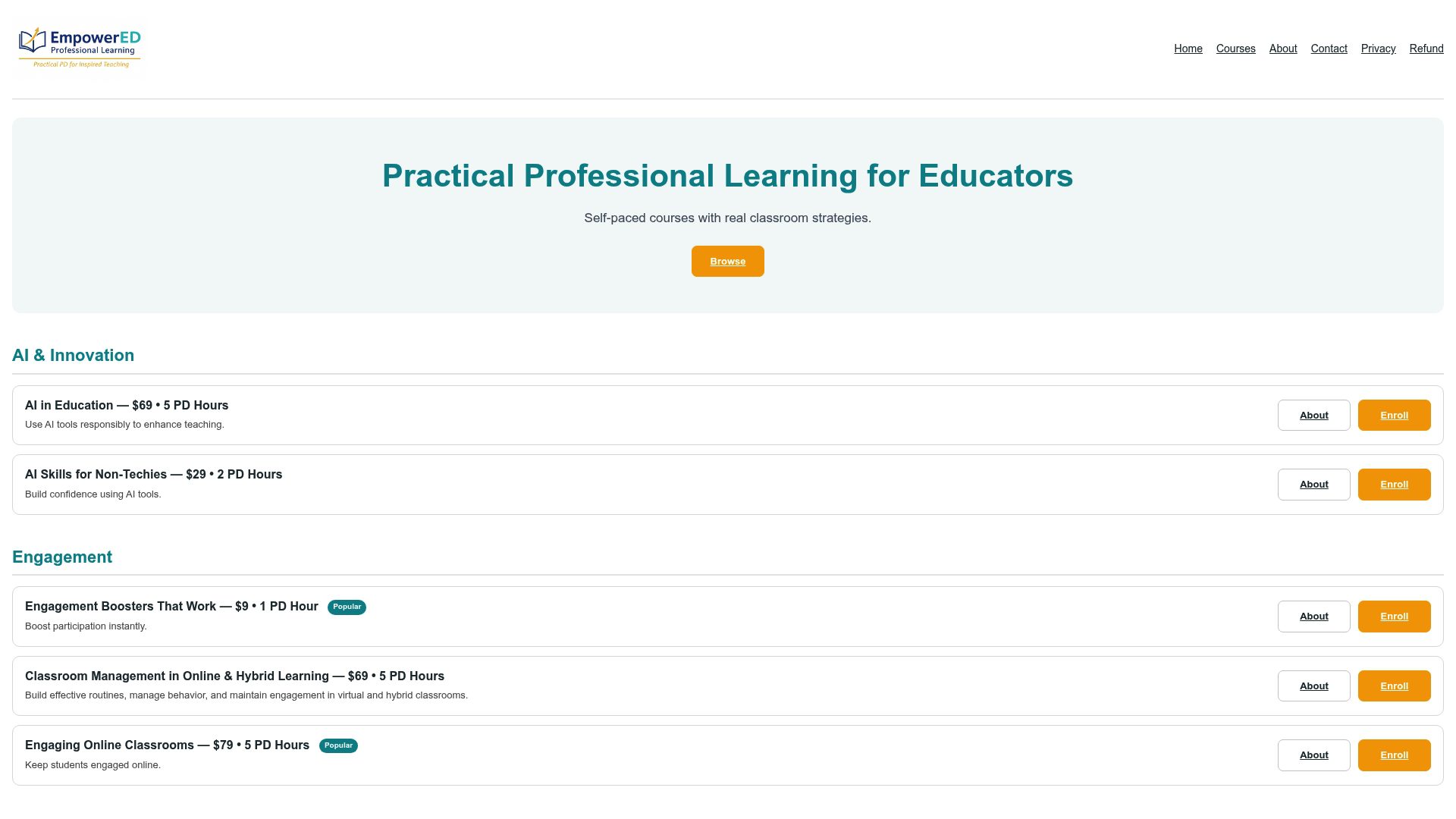
Data Literacy for Teachers walks through exactly the kind of map-and-dataset lessons covered in this guide and includes instructor feedback and a PD certificate that you may be able to apply toward your requirements. If your bigger need is building accessible, differentiated lessons across the board, the Professional Learning catalog lets you and your team pick a single course or build a multi-course pathway for staff-wide development. Start with one course that matches your most immediate classroom gap, then add the next once you see how quickly the strategies translate into practice.
Sources
- NOAA Science On a Sphere — Data Lens teacher guide
- National Geographic Education blog — Exploring the world through mapping
- Geographies of Change: ArcGIS-based inquiry capstone (2026)
- Innovate Journal — digital mapping in K-12 social studies
FAQ
How Long Should a Map-Data Lesson Take?
Most classroom map activities run 10 to 20 minutes as a warm-up or exit routine. Larger projects, like a StoryMap or community-data overlay, can extend to multi-day units depending on your standards and available class time.
What Grade Levels Can Use Map-Data Analysis?
The six-step protocol (orient, observe, layer, interpret, verify, act) scales from elementary through high school with adjustments to complexity. Elementary classes might stop at basic observation and simple trend spotting, while high school classes can add overlay comparisons and causation analysis.
Do I Need Special Software to Analyze Map Data With Students?
No. Free classroom tools like NOAA’s SOS Explorer and National Geographic MapMaker cover nearly every K-12 use case. Advanced GIS platforms are only worth introducing in dedicated high school electives with sustained project time.
How Much Does EmpowerED’s Data Literacy Course Cost?
Data Literacy for Teachers is priced at $79 as a one-time purchase and includes personalized instructor feedback and a PD certificate.
How Do I Assess a Student’s Map-Data Project?
Score against four criteria: a specific claim, cited evidence from the map, a logical interpretation connecting the two, and clear provenance showing where the data came from and whether the student verified it against a second source.